Wigle Reserve
Brand & Product Redesign
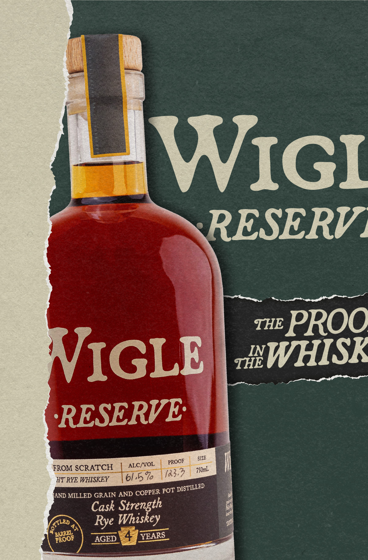
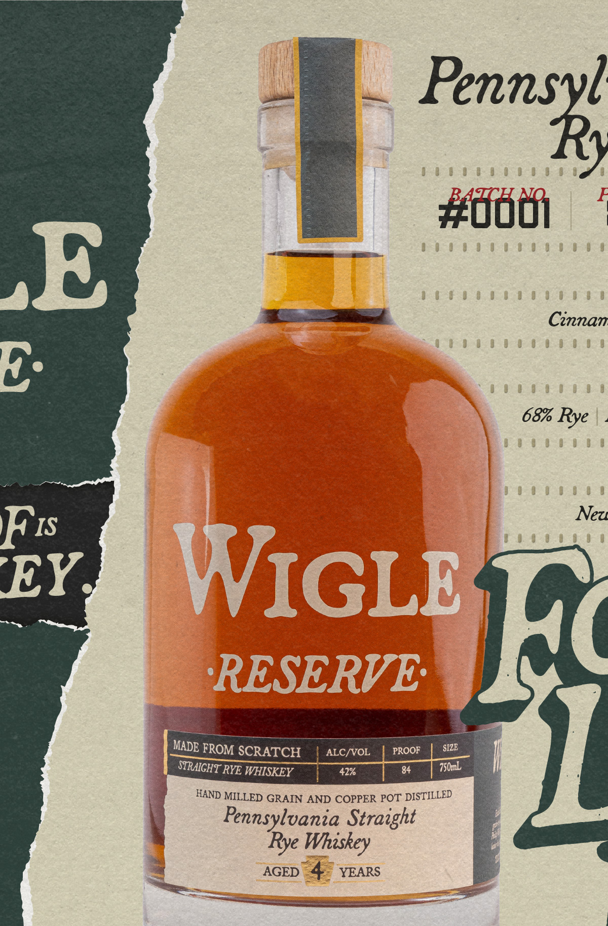
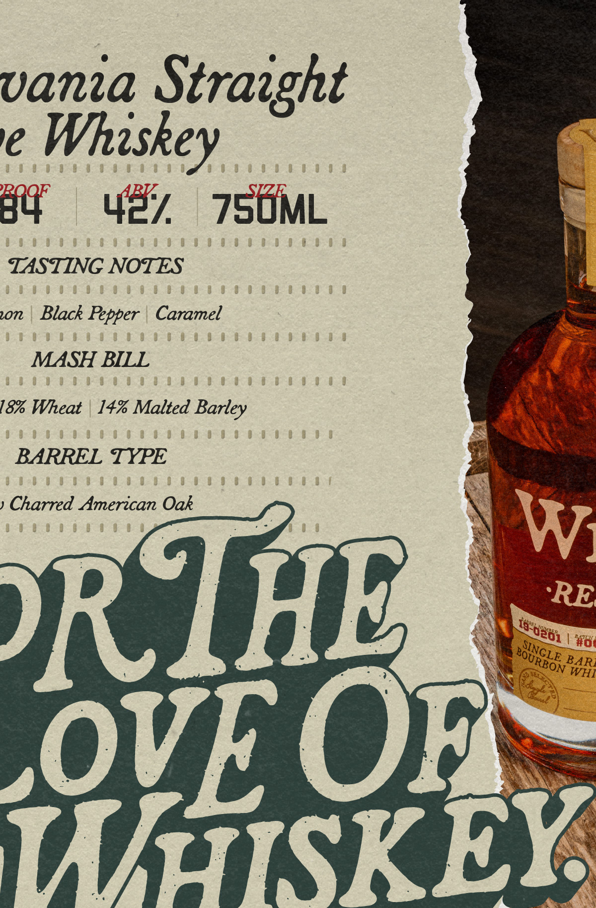
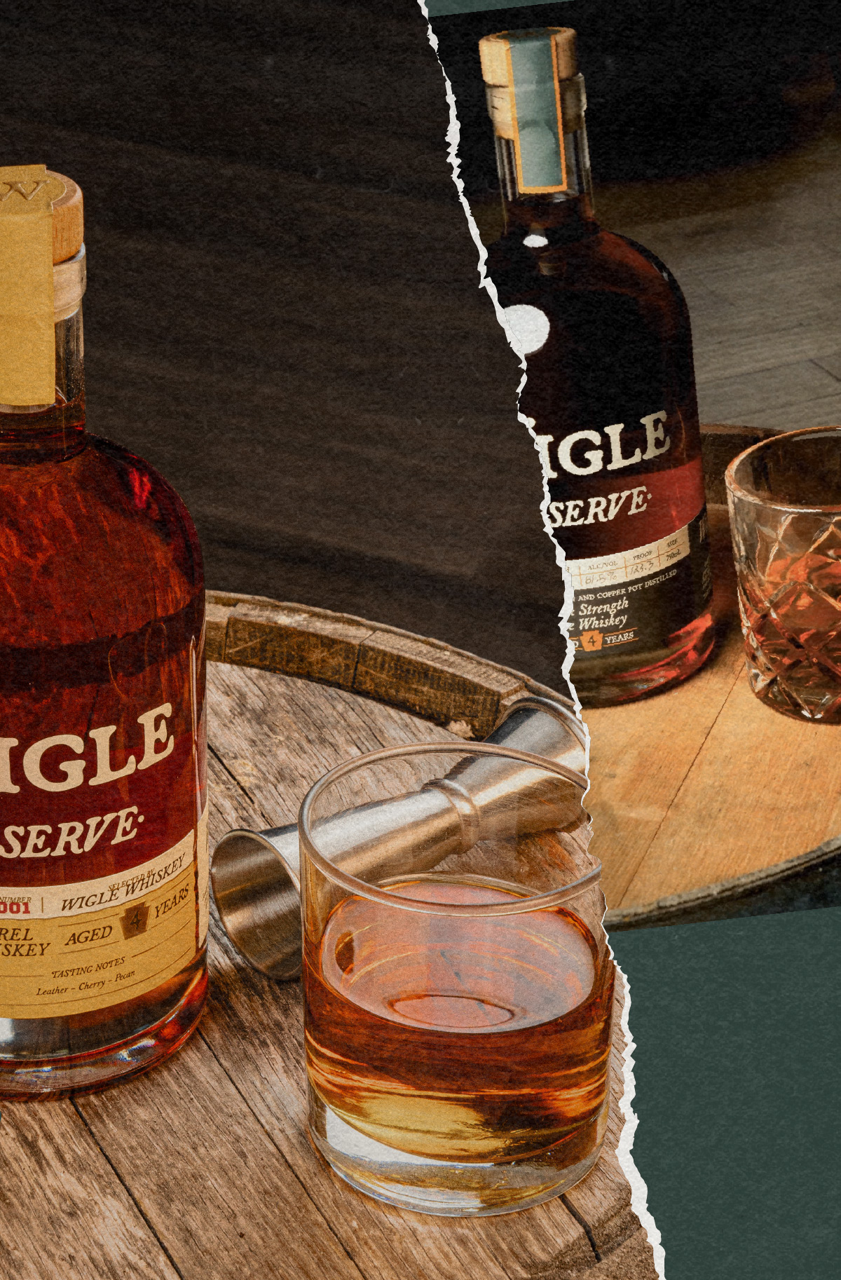
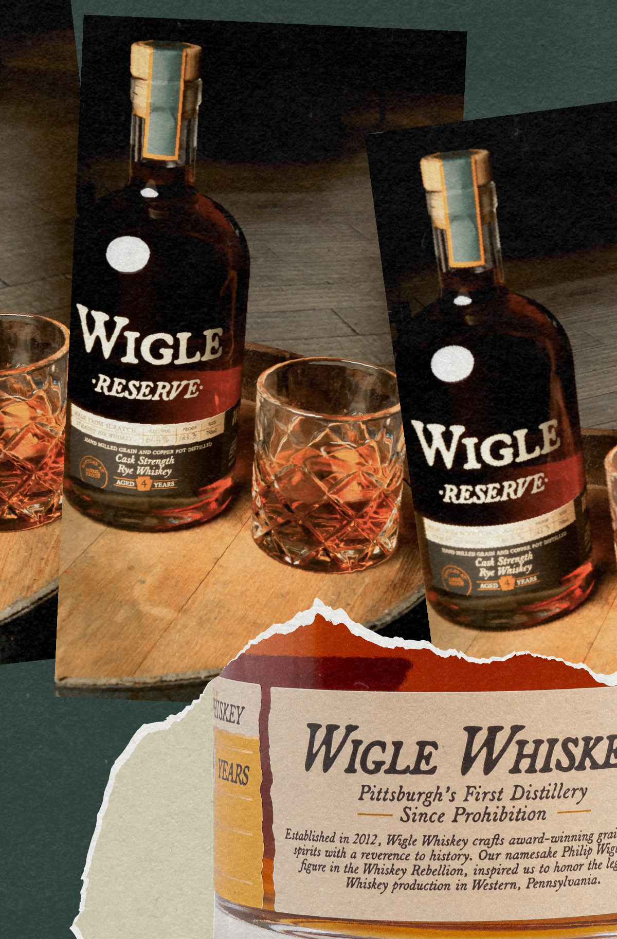
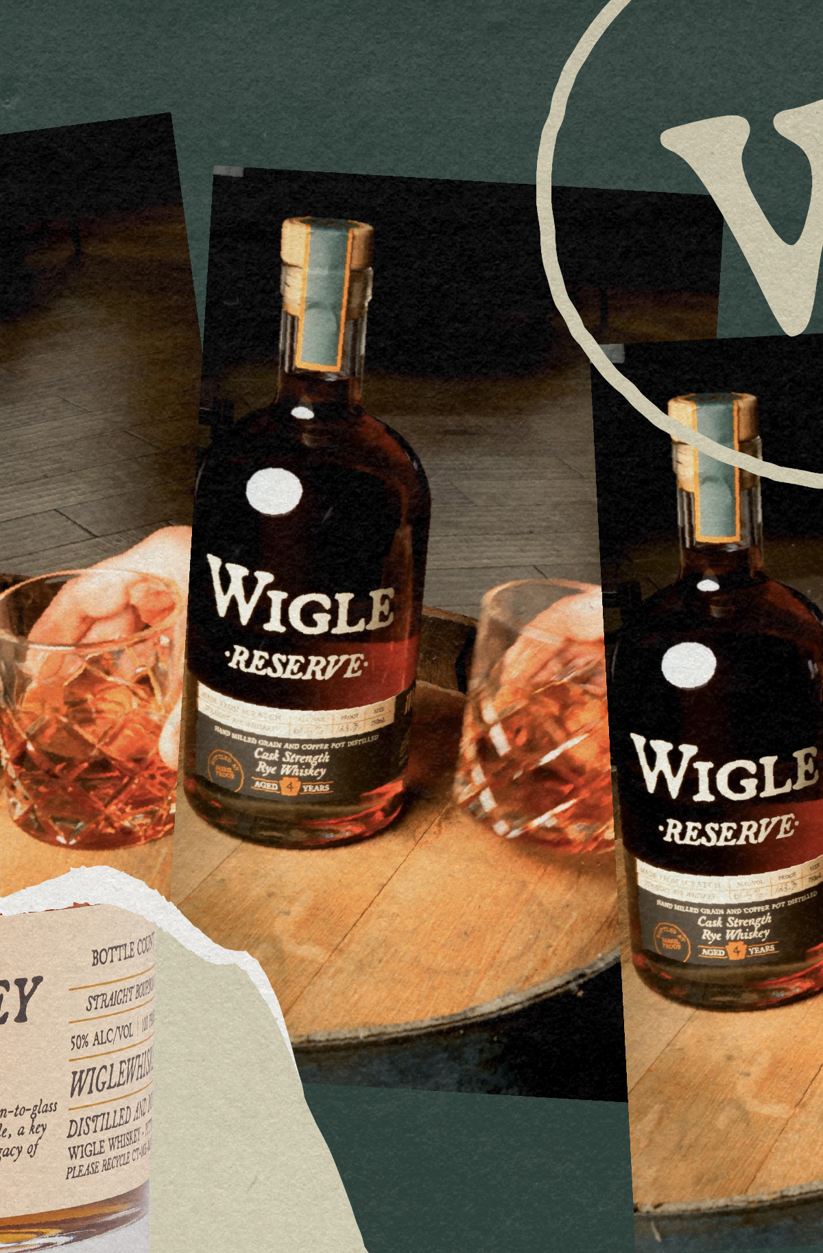
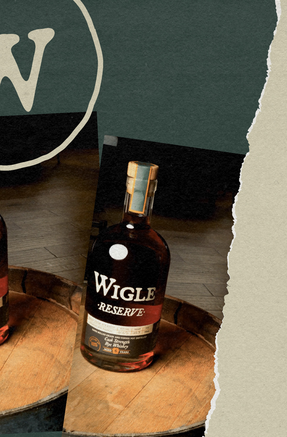
Pitch: “Make our whiskey brand feel more serious.”
For over a decade, Wigle Whiskey has been a fertile ground for innovation in the realm of classic spirits. While I deeply appreciated the whimsical charm of its original branding, the task of envisioning Wigle as a quintessential whiskey brand presented an exciting challenge. Whiskey, deeply entrenched in American history for over two centuries, carries an identity that’s ingrained into consumers. Exploring the intricacies of design within whiskey products is a fascinating journey, with each element carrying its own story. Yet, in the realm of consumer expectation, there’s a palpable familiarity surrounding what a whiskey product embodies.
While meeting the fundamental objective of aligning with customer expectations for a whiskey product, our redesign also tackled a more ambitious task: crafting versatile formats and layouts across all product categories using identical dielines. Beginning with the standard blended offerings and progressing to the esteemed cask strength and single barrel selections, these labels dynamically evolve to intuitively differentiate between product tiers, effortlessly signaling the exclusivity of each offering.
